Per Mollerup is a Danish designer, specializing in sign design. His latest book, Wayshowing, A Guide to Environmental Signage Principles and Practices is fun. It's an substantial book: thick, tall, heavy and full of photos of different types of signs. 333 pages. You can get the book for under £30 which I think is ok for a book like this.
To me, this is the kind of book where you don't read the (little) copy there is; instead, you stare at the pictures a long time and try to made your own script and add meaning to it all. To a sensitive eye, there are more details to be found that way. This is a nice thing about the book. The (possibly) bad thing is that it doesn't provide any sense of progress in design, how signs mature and are developed. I know I would have liked to see more about that. Or, maybe just a bit more personal critique on the many images shown. In design books, everything sometimes seem so... "fait accompli" if you know what I mean.
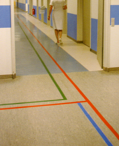
I made a rough scan from the book, on signs in hospitals. This image is quite typical for the book.
I show below (on mouse over) what will happen if you make the below photo of a Danish hospital floor to grayscale, as if you were completely color blind. Suddenly, the other non-guiding colors become confusing and disturbing; what does the colored walls mean? Why does the floor color change when you step into the ward? Why is the wall color inside the ward from the floor up, and outside the ward the color is a a meter up? Why is a strip of the ward floor white? In the end of the corridor you can see the wall color changes to yellow. Are all these changes in color deliberate? And, what's the phone number to the nurse walking away? So many questions... ;-)
See his books at Amazon UK. The web site for his company is unusable... predictable I would say.